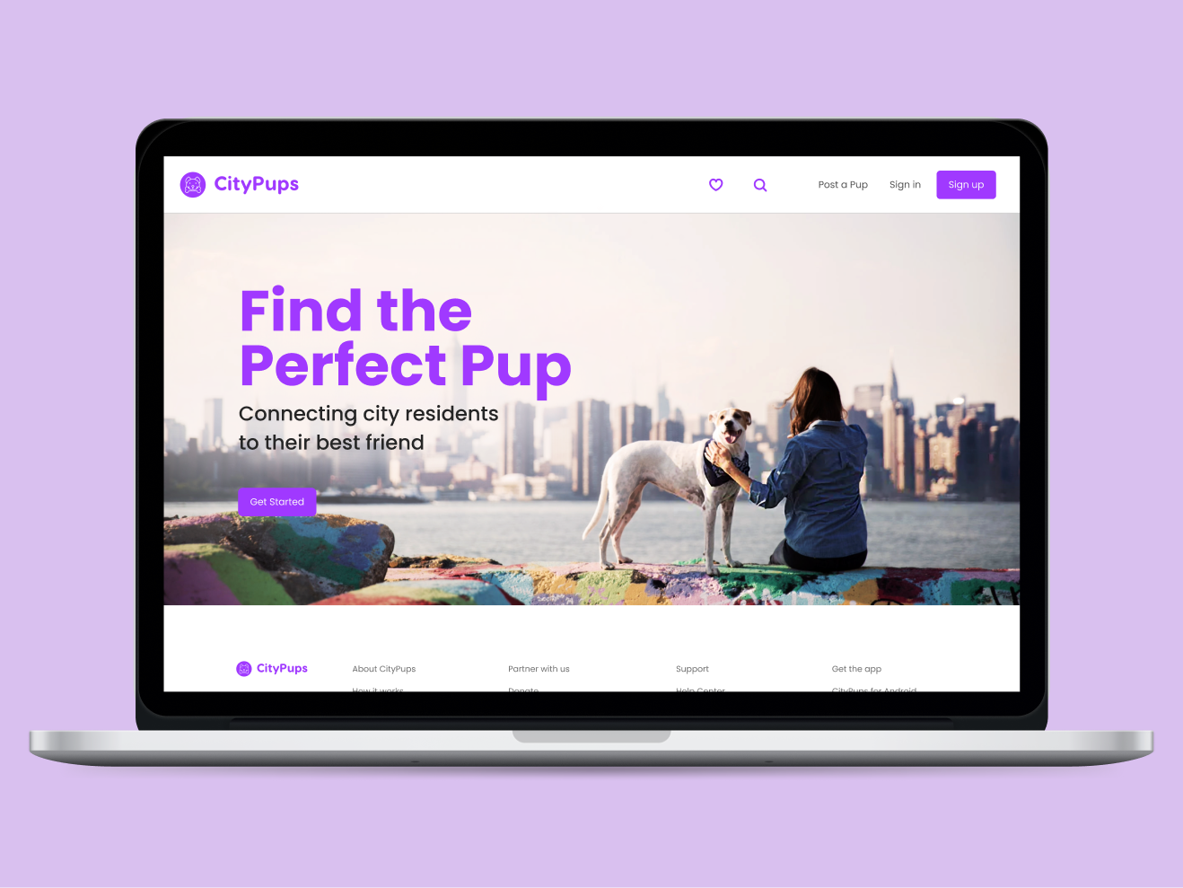
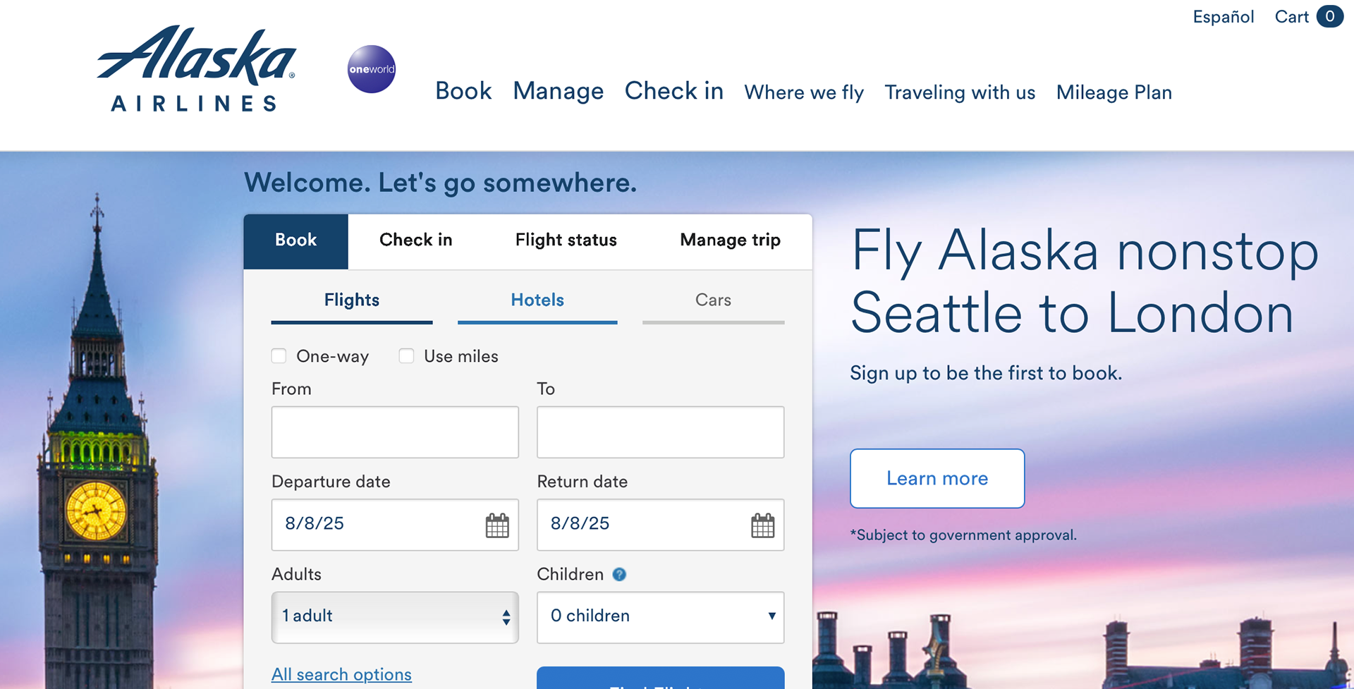
Improving the Date Picker component for Alaska Airlines' Flight Search experience
Role
Design System UI Designer
Tools
Figma (Variables, Conditional Logic, Prototyping), Design Tokens, Variant Management
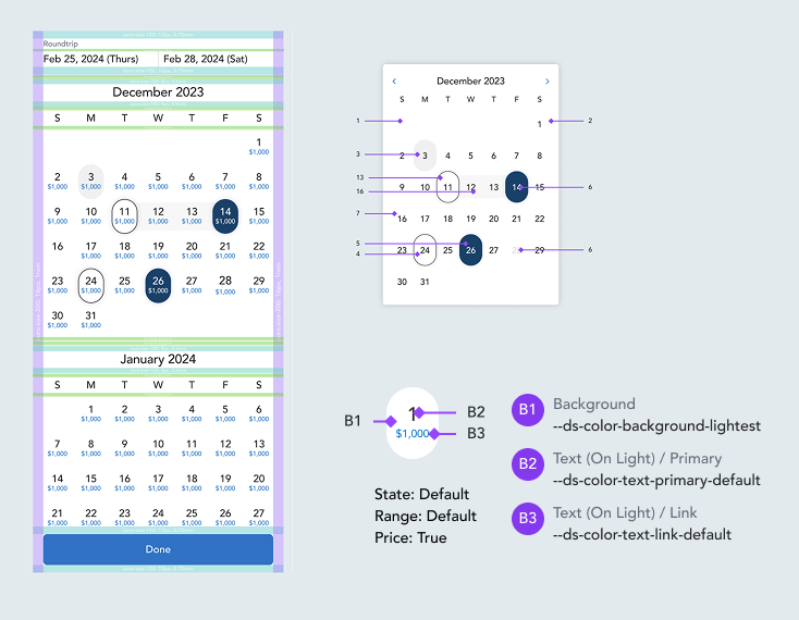
As part of the Alaska Airlines design system team, I led the redesign of the Date Picker component used in the flight search experience. The goal was to improve usability, scalability, and flexibility across brands and breakpoints, while incorporating the newest Figma prototyping features to streamline testing and Engineering implementation.
Problem
• Component was visually inconsistent across platforms.
• Poor accessibility and clarity for unavailable dates.
• Did not scale well for mobile, especially 320px widths.
• No support for theming across brands or seasonal campaigns.
• Problems with spacing and bottom gradient
• Engineering teams lacked a clear interaction model for unavailable or sold-out dates.
Goals
• Improve usability and consistency of the calendar UI.
• Increase flexibility via theming support.
• Enhance mobile responsiveness resolution.
• Enable design system compatibility with modern prototyping and logic tools.
• Increase flexibility via theming support.
• Enhance mobile responsiveness resolution.
• Enable design system compatibility with modern prototyping and logic tools.
General Improvements I made
✅ Added slot for dynamic date content (contextual messages, icons).
✅ Removed bottom white gradient (simplify and make consistent).
✅ Made action button full-width for better tap target.
✅ Introduced Popover feature to indicate sold-out/unavailable dates with hover/tap.
✅ Integrated theming support via color tokens and Figma variables.
Mobile-Specific Updates:
✅ Made responsive across breakpoints, including 320px mobile screens
Restructuring Token System
Auro, Alaska Airlines’ design system, is evolving to support theming capabilities so any product group can seamlessly adopt it. I’m contributing by restructuring design tokens and ensuring alignment with other product design systems.
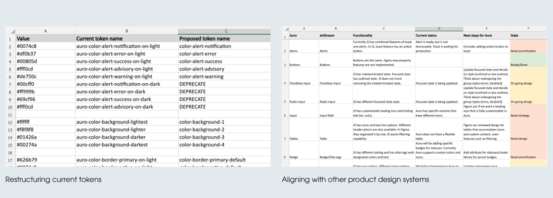
Changes
Impact
• Improved clarity and guidance for users booking flights.
• Fully responsive layout now handles all mobile breakpoints, including edge-case screens.
• System now supports brand customization and future seasonal theming without new component builds.
• Faster testing through interactive prototype saved engineering review cycles.
• Fully responsive layout now handles all mobile breakpoints, including edge-case screens.
• System now supports brand customization and future seasonal theming without new component builds.
• Faster testing through interactive prototype saved engineering review cycles.
Figma Blueprint
final specs for Engineer handoff