Introduction
I completed a five-day modified Google ventures design sprint, testing solutions to help users find their dream dog. The goal of the sprint was to address usability issues for City Pups, a startup that matches city dwellers with dogs that fit their city lifestyles.
Role: UX/UI Designer
Duration: 1 week
Platform: Figma
Problem
People in cities are struggling to find the perfect dog to adopt. As an owner of a wonderful rescue dog, this problem was important for me to explore because of the large number of animals in need of a forever home. Through previous research, CityPups has discovered that city residents struggle to find the right dog. This is due to a lack of information and their unique needs. City dwellers need to consider factors like their small living spaces, transportation, busy schedules, energy level, and their congested neighborhood. CityPups would need to filter through the dogs to make the user feel confident based on their unique city lifestyle.
Design Process
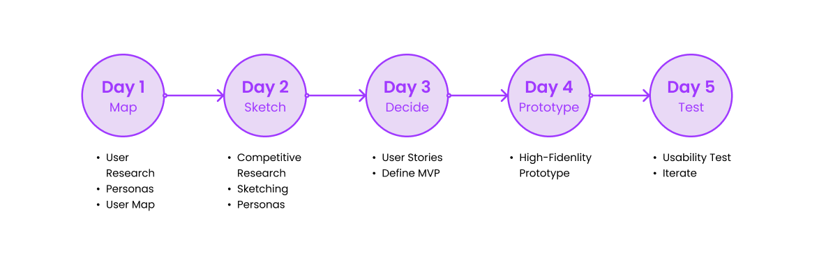
Day 1 - Ideating
How might we?
How might we efficiently help city residents find the perfect dog that fits their unique city lifestyle?
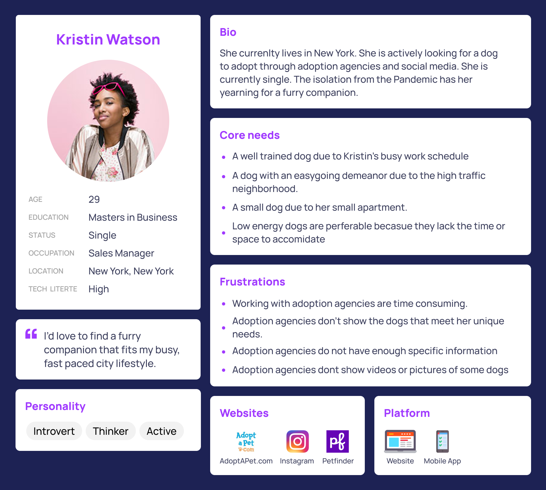
User Persona
Google Ventures provided information to develop a user persona.

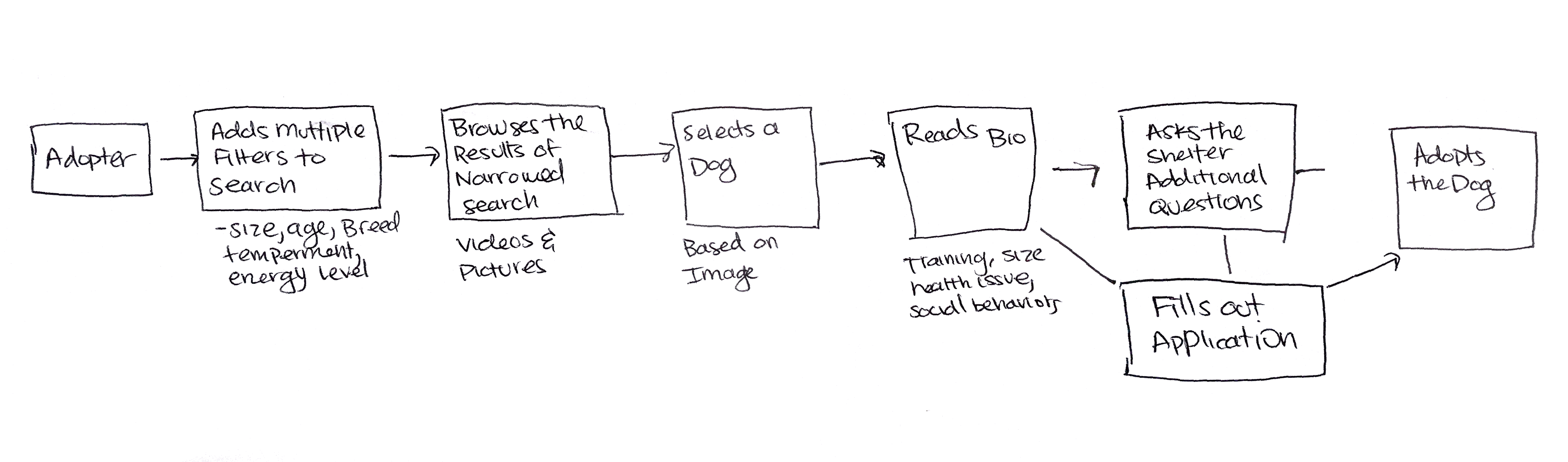
End-to-end user experience
This model defines each step of the process of adopting a dog.
Day 2 - Sketch Your Solution
Competitor Research (Lightning Demos)
Match.com has a questionnaire feature that offers great feedback and is full of personality. Match also shows users a small preview of their matches at the bottom. Match also displays a user's results with the ability to change their answers easily. It shows a list of matches to explore and how close they live in proximity.

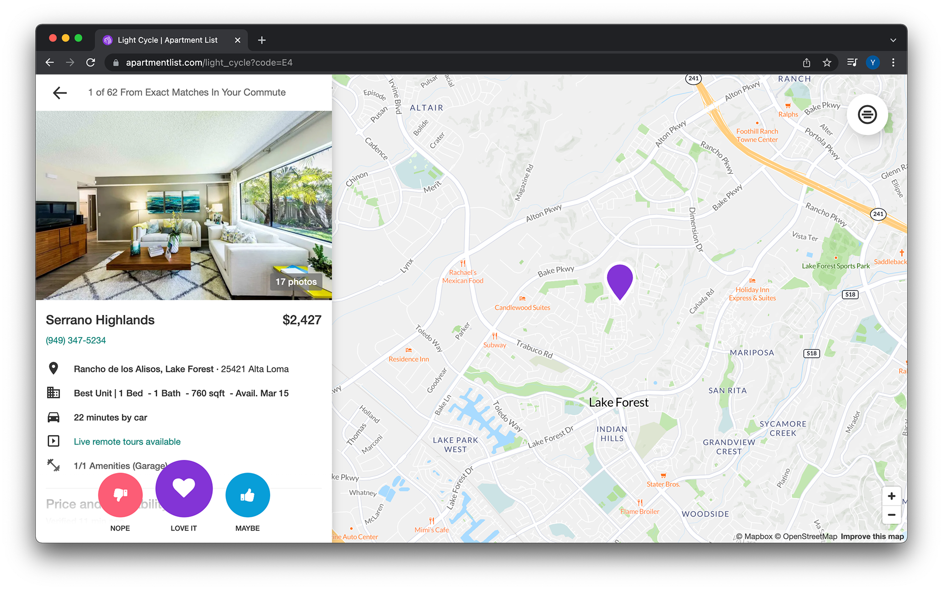
Apartment list has dynamic visuals such as pictures, videos, and maps. This shows uses all the information they requested in the initial questionnaire and nothing more. I love the large CTAs and icons.
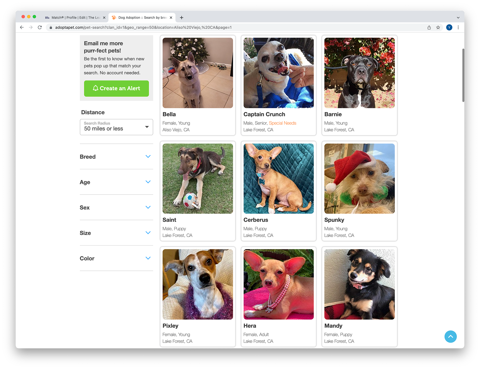
Adoptapet lists your matches and has the changeable filters on the left. However, the filters could be more detailed.
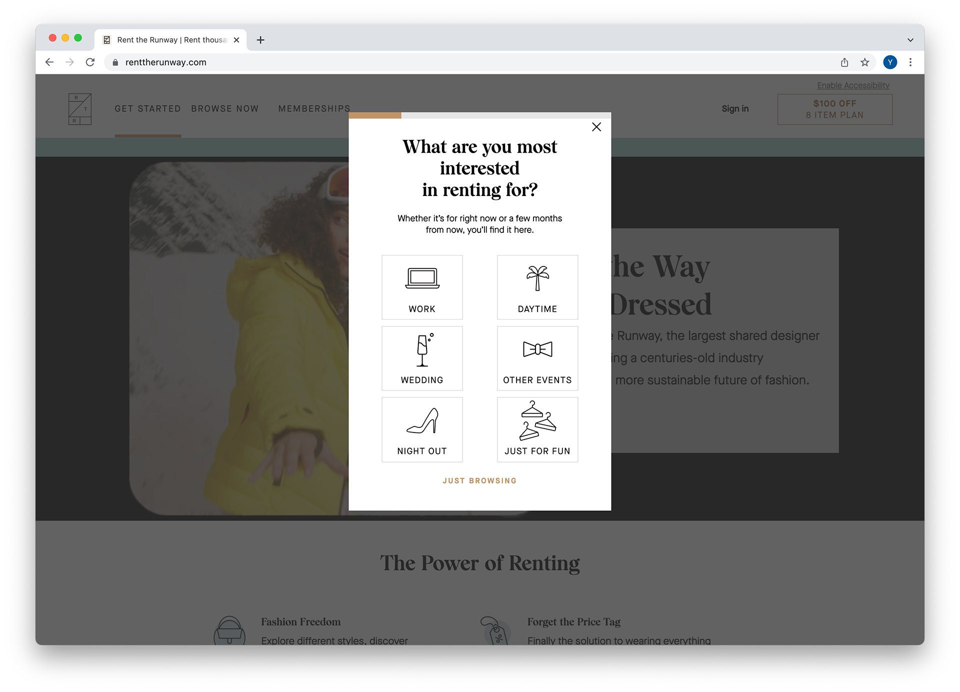
Rent The Runway uses recognizable icons, progress feedback, and doesn't take the entire screen.
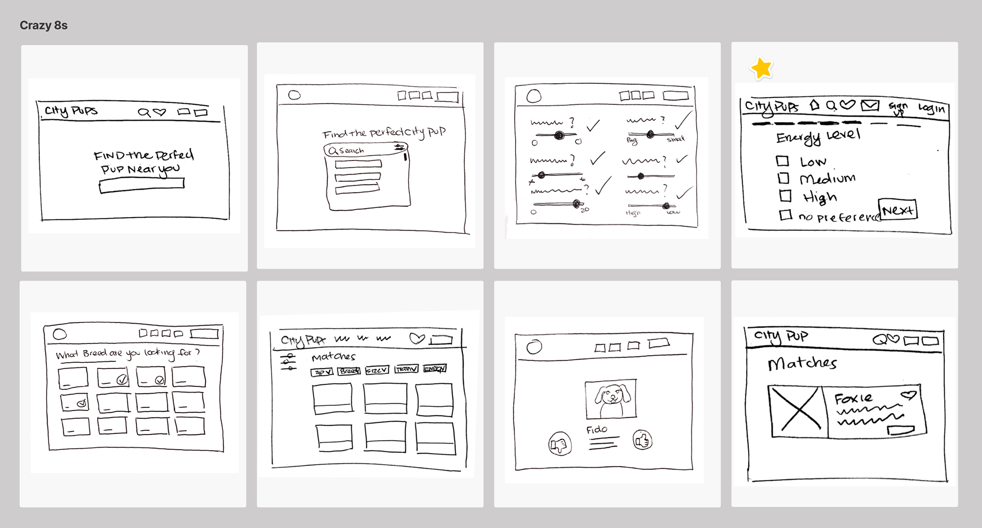
Crazy 8s exercise
The starred screen is the most critical screen because it represents the question used to collect the users needs and interests.
Solution Sketch

Day 3 - Decide and Create a Storyboard
Decide
I decided on the questionnaire feature because it quickly takes the user to the next question without confusing the user about the next step. The results are populated immediately after completion of the questionnaire. The user can freely browse and learn more about each dog knowing they all meet certain criteria.
Storyboard
I first tried to visualize the user’s thoughts and environment. Then I illustrated the steps that they would take to search for the perfect dog. These steps became the solution for my prototype.

Day 4 - Prototype the Solution
I created a high-fidelity prototype because I enjoyed its artistry of it. My goal was to create a simple interface focusing on the task of collecting the user's needs and browsing the results. I hoped to learn the best way to phrase each question. The detailed questions allow the users to be matched with a dog based on their unique needs.
Day 5 - Validate
I tested my prototype with five experienced users, which gave me several insights. These users had adopted a dog within the past 3 years. I interviewed them via zoom for convenience and social distancing purposes.

User Testing Insights
One challenge was writing the content for the website. Through Usability testing, I realized a lot of my questions were vague and confusing. I had to research a dozen dog adoption websites to learn the correct verbage to use.
• 2 out of 5 users were confused about the question “How many miles are you willing to travel?”
• 5 out of 5 users successfully clicked the “Get Started” Call to action on the home screen when asked to search for the perfect pup.
• 2 out of 5 users immediately recognized the app as a way to be matched with dogs in the city.
• 2 out of 5 users noticed that you couldn't deselect an answer
• 1 out of 5 users mentioned that they would like to make an appointment with an associate.
• 3 out of 5 users wanted to interact with a person. A user said “I want to confirm the agency is as committed as I am”
• 1 out of 5 users didn't understand you can type the breed in the text field
• 3 out of 5 users thought some of the adoption application questions were too vague
• 2 out 5 users thought that the application confirmation was inadequate, noting “You are one step closer to adopting your perfect pup’ is too vague.
• A user suggested that it should say something like “Your application is under review and you will be contacted within 48 hours.”
• A user suggested that it should say something like “Your application is under review and you will be contacted within 48 hours.”
Final Design
Questionnaire Submitting Application
The future
in my survey. In the future, I would love to create chatbots for the user to directly interact with the adoption agencies. I want to add more personality to the questionnaire feature by creating icons representing each question. I love to add a feature where you can schedule a meeting to see the dog and speak with an associate. However, applying to adopt is an uncertain task, and realistically the review process could be nerve-racking for the applicant. My mission would be to create more transparency around the process, reassuring that applicants always know the status of their application